Case study
One system,
every placement.
Scale AI needed static ad creative that could flex across audiences and placements without drifting out of brand. This is how the system was built, including the template that broke the first time someone typed a longer job title into it.
What Outlier is
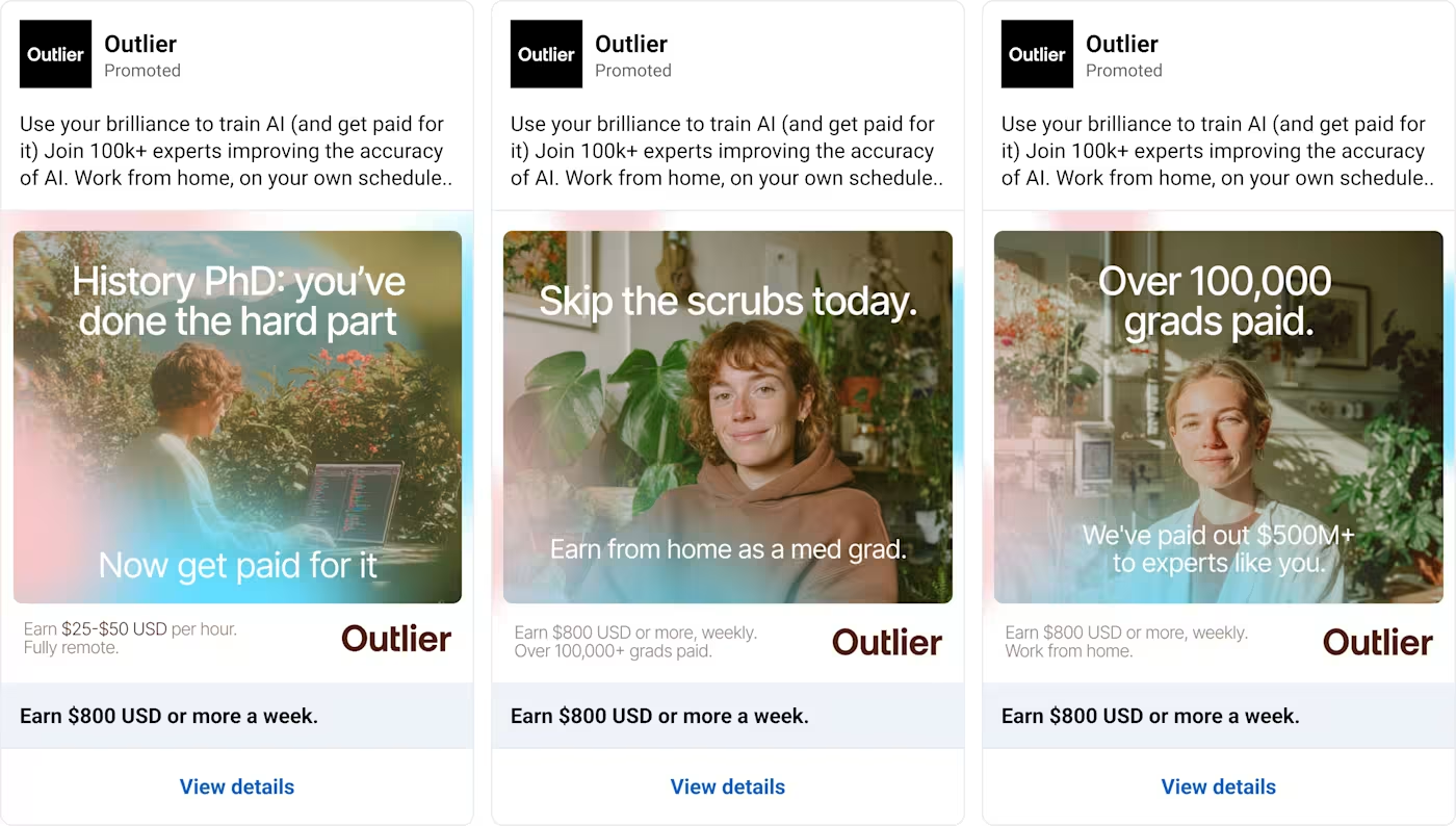
Outlier is a platform powered by Scale AI that connects subject-matter experts, developers, researchers, doctors and academics, with paid work helping train and evaluate AI models. The advertising has to reach several very different audiences at once, which is most of why the creative problem is interesting.
What already existed
This was not a blank page. Scale AI had static ad creative, brand guidelines, illustrations and Figma assets before I started. My job was not to invent the advertising. It was to design new concepts, improve the templates they already had, and build reusable systems so their team could produce variations without rebuilding a layout every time.
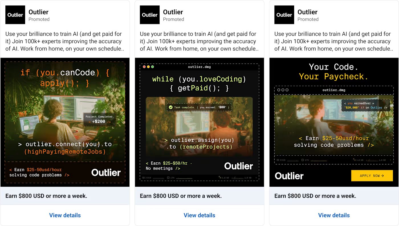
The work covered developer recruitment ads, LinkedIn style job ads, branded campaigns, university recruitment creative, ResearchGate ads and printed flyers. A separate Scale AI sub-brand, Human Frontier Collective, had its own identity and ran alongside it.
The actual problem
The problem was not producing one good ad. It was producing the fortieth one without it drifting away from the first.
They needed to change headlines, imagery, colors, logos and job information across many ads. Done manually, every variation is a fresh file, and every fresh file is a chance for the spacing to shift or the type to go slightly wrong. One early brief asked for two headline variations in both 1:1 and 9:16. The obvious answer is four separate static files. The useful answer is a system where the content updates from one place.
The hard part was never speed on its own. It was holding consistency while still allowing the thing to flex. A headline that sits perfectly in one version overflows the moment someone swaps in a longer one. Same with job titles. Same with locations.
How the system was built
Every template splits into two halves: what is locked, and what is meant to move.
Locked: the layout structure and spacing rules, brand typography and hierarchy, logo placement, image containers and aspect ratios, CTA styling, and the relationships between shared components.
Variable: headlines and secondary headlines, supporting copy, imagery, brand color combinations, logos where a sub-brand needed one, job titles, locations, skill labels and CTA text.
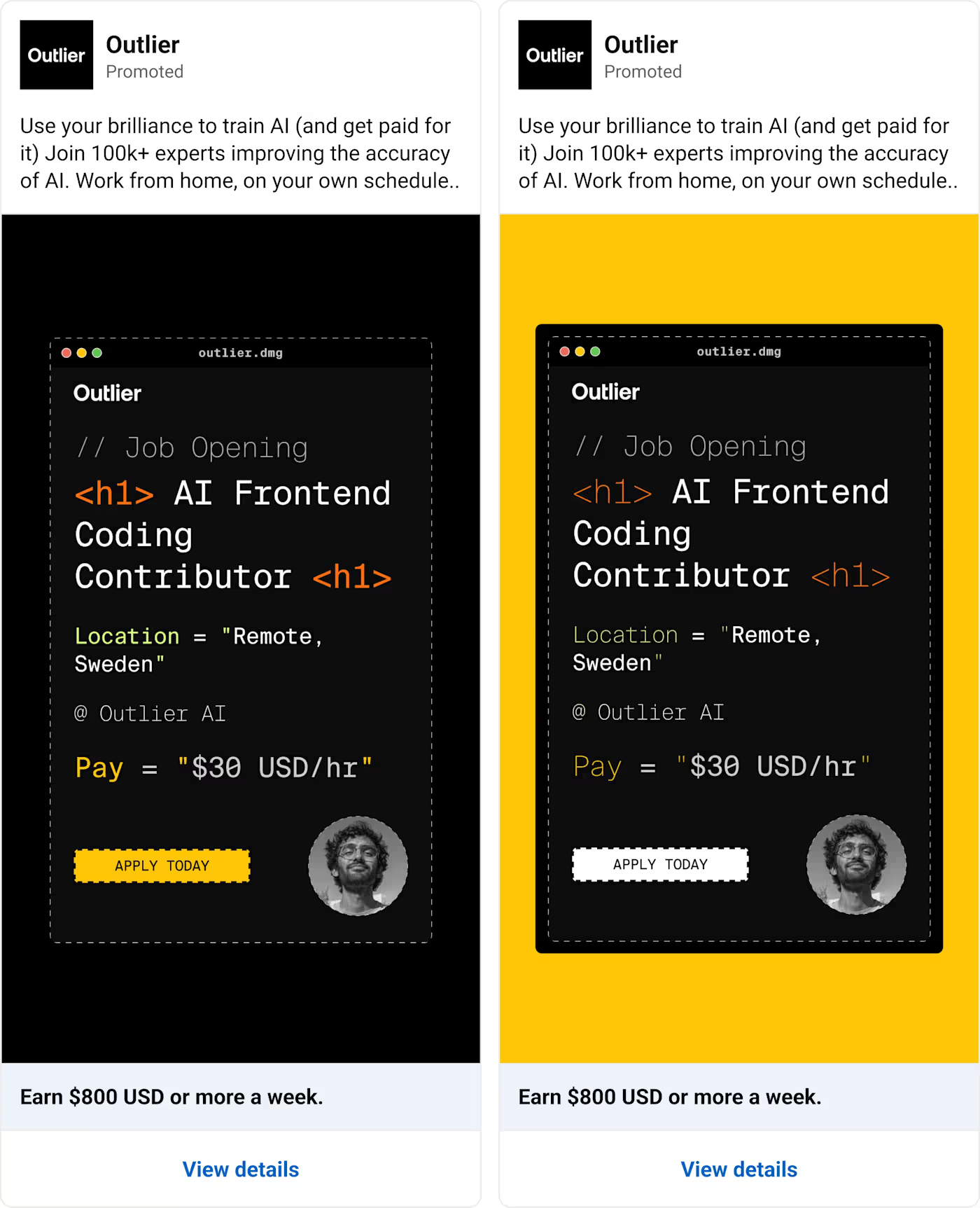
In Figma that became main editing frames acting as a central source. The team updates a headline in one place and the variations that depend on it follow. Alongside that I organized imagery options and color libraries, so switching the visual direction of a campaign did not mean touching the layout at all.
Why 1:1 and 9:16 are not the same ad
For the first template system I built the square and vertical layouts separately, sharing one content structure and the same reusable elements.
That separation matters. Cropping a square ad into a vertical frame does not reliably work. Headline line lengths change, image proportions change, the safe area moves, and the logo ends up somewhere it was never meant to sit. Sharing the content model while building the layouts properly for each placement is slower once and correct every time after.
The thing that broke, and what it taught
The LinkedIn job carousel template is the honest example.
It looked right in review. The example copy was short, the cards were even, everything sat where it should. Then longer job titles and locations went in and the text stopped wrapping correctly.
I fixed the text resizing and layout behavior so longer copy wrapped properly. But fixing it surfaced the real constraint underneath: if both the job title and the location run long, the card gets crowded and stops matching the others next to it. Unlimited flexibility just moves the failure somewhere less visible.
So I flagged the trade-off rather than hiding it. Either copy stays within a sensible length, or the card layout changes to accommodate it. Quintin picked the direction from there.
That is the part people underestimate about building creative systems. Making components is the easy half. The real work is anticipating what happens when someone who was not in the room replaces your example content with theirs.
What was handed over
Organized Figma files with reusable templates, components, clearly marked editable areas, imagery options, color libraries and instructions. I annotated the files directly, noting which regions were meant to be edited and which structural elements should be left alone.
The test for a system like this is whether someone who did not design it can use it without breaking it. That is what the notes are for.
What changed
The team ended up with reusable Figma structures for producing further variations. Rather than editing every ad by hand, they could work from the main editing frames, swap imagery, update headlines and pull from the existing color options. The approach carried across multiple briefs: branded ads, developer-focused campaigns, LinkedIn style job ads.
Tamer was incredible to work with. Responsive, quick turnaround, asked the right questions, and created creative systems for us. He is truly a 10x designer, great for any tech startup.Quintin Au, Scale AI
What I will not claim: I have no verified before-and-after production time, no percentage improvement, and no advertising performance figures. Those would need evidence I do not have, so they are not here.
How it ran
May 2025 to February 2026, across a series of briefs: early reusable Figma systems, code-centric branded ad concepts, a brand refresh with new templates, ResearchGate creative variations, a university flyer, and later the separate Human Frontier Collective project.
Individual briefs usually ran on one to three day turnarounds.
What the work actually was
The story here is not that I made static ads for Scale AI. It is that I built reusable creative systems that made the ads easier to produce, update and adapt across campaigns and placements.
The design mattered. So did the decisions underneath it: what should stay consistent, what needed to stay flexible, and how to keep the templates from breaking the first time someone put real content into them.